Showing posts with label cards. Show all posts

Monday, October 29, 2007

Christmas Stamping

It's one of those things that I think I'm going to 'neak up on (as my Dad likes to say - rather than sneak). I need to make my Christmas cards - all 100 of them. I've yet to design them.

But, I've been stamping a Christmas card here and there... hence, I'm sneaking up on the total. I'll get there... Never fear.

So, here are two that I created this weekend. I love designer paper - so that was the basis of the designs:
The picture doesn't really do this card justice. The main image was stamped on Poison Ivory cardstock with Brilliance Coffee bean ink, colored with copic markers, and cut out with a Nestabilities scallop die. While the die was in place, I sponged Creamy Caramel ink around the tree for a sepia tone. The designer paper is Basic Grey Fruitcake paper and is stitched together. It's all layered on a cardbase of Prism Desert Coral Dark paper, which is a rich earthy color - and not really a traditional Christmas color. Topping it all off is a K-ology metal brad.

My second card is similar in colors with a ruby card base, olive matte and caramel brown around the sentiment. Maybe the beautiful Autumn colors in St. Louis were coloring my theme!

Thanks for stopping by,

Lisa

Sunday, September 23, 2007

Irises... Take Two

Hi again! I thought I'd try to alter the card I pictured below to see if I could improve it...

Ultimately, I decided to remove the velvet ribbon. I think this simpler version works better for me... so I thought I'd share it with you.
I'm happier with this version. It's not an overly detailed card, but I think the central image can lend to a simple card.

To test this theory, I used the same CHF Irises on a simple Arturo notecard.

I stamped the image in Versamark and embossed with black detail. I watercolored the image with my crayons and highlighted with the white gel pen. I sponged light purple ink around the image, the notecard edge and around the sentiment (part of the Birthday Wishes sentiment also from CHF). I kept the purple velvet ribbon on this one... but I think it works.
Thanks for stopping by~
Lisa

Wednesday, September 19, 2007

Sunny Days

This Cornish Heritage Farm Apple Tree image was a must-have for me... I saw this beautiful tree and knew I'd buy it immediately. It's an image that can be used for a scrapbook page on an apple-picking outing, a seasonal card to say you're thinking of someone, or a masculine (non-floral) image.

The card also uses another of CHF's new backgrounder stamps - Cheesecloth. It's a great neutral background and makes a textural impact on a relatively simple cardfront.


The card is fairly simple, but what is different about this card is that the green panel is the window to the Apple Tree image. It's popped up on dimensionals from the cardfront / main image.

Here's a close-up of the tree:

I love how this colored! I smile every time I see this image. It's just that sweet.

Thanks for stopping by!

Lisa
++++++++++++++++++++++++++

Stamps - all CHF - product names are active links to find on the CHF website: Apple Tree, Sunny Days sentiment, and Cheesecloth backgrounder (NEW)
Paper: Grass green, blue-green, and white cardstock
Ink: Adirondack Pitchblack ink by Ranger, Blue-green ink (to sponge), Grass Green, Copic Sketch markers (G40-Dim Green, YG17-Grass Green, B00-Frost Blue, E27-Africano, E31-Brick Beige, R29-Lipstick red, C5-Cool Gray, 0-blender)
Embellishments: stitched ribbon, silver brads, sponges, dimensional tape

Thursday, September 13, 2007

My Favorite Things - Coffee

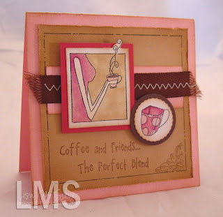
I had won a gift certificate from Julie Campbell - Stamped in His Image - as blog candy and had a chance to shop at Paper Pretties. I know... great give-away, wasn't it?!?! I purchased a stamp set that I'd been eyeing for quite some time. It's called Hot Stuff by My Favorite Things. These were my very quick cards for the set...


The images were smaller than I thought... but not a problem at all. I love to make small square cards. The central image (Kim's signature style is a truncated view of people doing their favorite things!) is colored with copic markers. I highlighted the coffee with glitter pens.

I think the fun part of these cards is the Creamy caramel matte. I used a micron pen to create a frame, mirroring the same one in the central image. It's fun! I'm really happy with these quick cards and know I'll be pulling this set out to make more fun cards in the future!

Both cards are in my gallery at SCS, if you'd like to see the full recipe of supplies - links active below:


Blue card / Thanks a Latte


Pink Card / Coffee and Friends...


Thanks for stopping by,

Lisa

Wednesday, September 5, 2007

Rachel's Creations

I had to share these cards with you tonight. My daughter, Rachel, is 9... almost 10 (she reminds me). She is funny, sweet and creative.

She made two cards to give her friend and I thought I'd surprise her by posting them here...

Rachel made the cards in colored paper and colored the images with her watercolor pencils. She has a stack of her own supplies and stamps... Can I just say that I'm super proud of her!
Thanks for stopping by!
Lisa

Tuesday, July 24, 2007

Bright Tri-fold card

I'm finally getting back into the swing of things. I stamped most of the day on Sunday to get ready for a class I have on Friday evening.

But, I'd promised myself that I'd work on something I wanted to do.

This card is really bright, contrary to the shadows in the picture. I was having trouble getting a good picture for some reason. I bet my camera needs charging...


The card base started with a 6" x 12" piece of Rose Red cardstock, scored at 4" and 8" - essentially in thirds. I trimmed 2.5" off the front fold, so the middle flap could be seen from the front. I stamped the front with a Crosshatch background and the sentiment "Warm Wishes".

The central image is GinaK's Daffodil design, embossed with detail black embossing powder. I used Copic markers to color the design (Baby blue and Buttercup yellow)... I should add here that I don't have a vast supply of Copic colors, so I'm using what I have to determine my color combos. LOL! I punched the image out, pierced each scallop, and adhered to a larger oval of Wild Wasabi green (cut out using my coluzzle). The ribbon is attached to the oval with a large staple bar and it's all popped up on the card base with dimensional tape.

The middle flap has a section of Basic Grey Romani striped paper on it. I used my scallop deckle scissors to edge the designer paper. Using my slot punch, I cut a notch on the DS panel to leave an opening for the Certainly Celery grosgrain ribbon.


I decided to send this to my mom's cousin, Lori, who was injured in a serious car accident over a year ago and has experienced a set-back with her health. I hope this brightens her day!


Thanks for sticking with me! I promise to have more soon!

Lisa

Thursday, July 5, 2007

Stitched Petals

Hi! This will be my last card post for awhile. My family and I are making our annual trek south to Florida tomorrow! I'm really excited about it. The packing process is exhausting though. Usually, I don't mind... and look forward to the weeks of planning and anticipation. This year, I just want to be there. I guess it doesn't help that I have to travel to Europe for work the week I return. I'm tired thinking of it.


But, I made a couple of cards when I should have been packing yesterday. This card was really fun, using the new Pick A Petal stamp set by SU. I used the new Groovy Guava (In Color '08) as the card base, Blush Blossom for the center matte (with Canvas BG stamped on it). I used the Groovy Guava and Really Rust for the petals. I faux stitched the edge and marked with a chocolate chip marker. The stem is faux stitched with always artichoke and a mellow moss ribbon knot for the leaves.

It's a relatively simple card, but I love the warm colors of Blush Blossom and the Groovy Guava together.

Thanks for looking!
Lisa

Wednesday, July 4, 2007

Simply Lovely

I am truly a huge fan of Gina K Designs. I'd bought this stamp from her and had yet to ink it (I know... bad). So today, when I should have been packing and getting things ready for vacation, I took a minute in the madness to make a couple cards.

This card is simple. The base is Bashful Blue cardstock (4" square card). The central matte is in Barely Banana (with Weathered background used) and the Image matte in So Saffron. The inspiration for the color combo... well... it's pretty simple too. I have been wanting Copic markers since reading about their versatility and amazing attributes on Splitcoast. I have bought a total of 6... a light yellow, pale blue, cool grey and green being some of them. Basically, I picked the matching paper so I could use them. LOL! I'd give my eye teeth to have the full sets, but I don't have the moola it would set me back. Maybe someday... unless anyone knows of a fairy stamp-god-mother handing them out???? No... OK. I'll just have to keep my day job.

I did take someone's advice on the white cardstock and bought a pack of Georgia Pacific 110lb cardstock from Walmart. It really is very amazing for the Copics, for layering the colors. I didn't have any luck with the other ultrasmooth stocks I had around the house. Even with that said, I don't have enough practice with the Copics to know if I'll be a whiz at them or not, but as far as a first attempt goes, I'm really happy with the outcome.


These daffodils are truly lovely, aren't they?

Thanks for looking. Happy 4th of July, everyone!

Lisa

Sunday, July 1, 2007

Love Trio Flowers!

Happy July, everyone! Where has this year gone? I can't believe we've passed the halfway mark for the year. I have so many personal and professional goals still on my to-do list... I'd better get a move on!

On a lighter note, I thought I'd post a quick card for you today. I made this card a couple of weeks ago and didn't get a chance to post it.


It's the second card I've made and posted with Flower Trio as the central image. I really love this stamp. I purchased it from GinaK about a month ago. It's a simple image... perfect for a detailed coloring...

The card base is Bordering Blue with a layer of Sahara Sand. The designer paper is Cosmo Cricket's Dutch Girl, which I purchased from a local Archiver's store. I could do some serious damage in that place... I made it out of the store, but only because my son was begging me to leave. I took pity on the boy...

The central image was stamped in Stazon Black ink, colored in with dye markers, and highlighted with prismacolor pencils. A small dot of silver Stickles was added to the flower centers for a little glitter shine. The flowers were matted on Ruby Red, which is a perfect match to the Dutch Girl paper. A little white organdy ribbon, dimensionals tape, crystal effects and silver cord are a few of the additional details to round out the card.

Thanks for checking in with me...

Lisa

Saturday, June 30, 2007

Beautiful Baroque

I jumped on the stamper's bandwagon and purchased Baroque Motifs from Stampin' Up. I really love this set for it's classy and elegant style. It's a set that fits my style... or at least one of my stamping moods!

The new In Colors this year are also really amazing. Not Quite Navy has always been a favorite of mine. The new Blue Bayou is a lighter version and is now my Favorite color!!! I also used River Rock, stamping the swirls in this color first. I added the Blue Bayou swirls just slightly askew to give the allusion of a shadow. The little flowers were added in NQN. A few added details: I used a NQN marker to faux stitch on the main panel and the sentiment panel. The main Flower image was inked in River Rock and rocked in Blue Bayou for added dimension. It's adhered to the card with dimensionals.

Anyway... that's all the details, but in the final analysis... I really like this card and the set. What do you think?

Thanks for stopping by!

Lisa

Wednesday, June 27, 2007

Bella Birthday

As I mentioned in my previous post, I'm a part of an online exchange group on Splitcoaststampers. I was assigned one person to send her packages and cards for about 3 months. It's a ton of fun, creating for someone... sharing a common hobby... and meeting someone new.


So... if you're in DDSS8, avert your eyes... OK... last chance...


You were warned! LOL!

I'm going to show you a card I made for my secret sis. She mentioned in her profile that she likes pink and brown as a combo and loves Bellas. I have two Bellas and multiple images that another friend stamped for me of others. Personally, the jury is still out on these girls for me. I like their whimsical design, but I'm not sure if they are my style... but still they are a lot of fun.


I used Pretty in Pink for the card base, chocolate chip (which I Cuttlebugged - is this even a word?? maybe Webster's will include this since it's a must have for me), and Close to Cocoa for the Scallop matte. I used a handy tip by Gina K on her blog (A Day in the Life) tutorial for Scalloped Rectangles found HERE. The dotted pink grosgrain ribbon covers the seam from two scalloped squares...


The Bella was watercolored and highlighted with a little glitter.


I'm hoping this card will make my sis smile!


Thanks for checking in with me!

Lisa

Wednesday, June 20, 2007

Another Fatherly card... and a near miss...

Using the same lighthouse from Stampendous, I created a simple card with the watercolored image as my central focus. I actually stamped this as a "practice" for watercoloring so I wouldn't mess up the Arturo cardstock.

Brocade Blue was the card base, stamped with the weathered background. The central image is distressed, inked on the edges and mounted on Night of Navy. The grey picture corners were mounted using dimensional tape after I inked the edges a bit. The twine (somewhat nautical right????) was added as a last minute addition, stuck to the card by threading through the navy organdy ribbon.


OK... so that is what I'd consider a "normal" guy card. This card is a stretch. But I really wanted to make it...

Not really a guy card, is it? But, I liked these little chicks and HAD to have the one for the Forth of July. The sparkler sold me! I stamped the chick, trimmed and mounted on a scallop square. I created the sentiment with my Karen Foster snap stamps (Formal in the small and mini - and mixing them to give a neat effect). I used a glitter pen to give the sparkler and the "O" in Reason a glow. The last fun bit was little bling sticker in the center of the sparkler.

So... not really a guy's card, but I liked it anyway.

Thanks for stopping by,

lise

Monday, June 18, 2007

Father's Day card

This is a super quick post since I'm headed out of town today. But, I wanted to show you a card I made for Father's Day.

I recently bought a set of gorgeous Arturo cards (in soft white) from Ellen Hutson, LLC. This paper is absolutely amazing and perfect for watercoloring. They also lend to the more simple card... so, this is what I made.

The stamp was a quick find at a Local Scrapbooking Shop. The LSS is moving, so everything was on sale for 30% off... my lucky day! It's a Stampendous lighthouse and I thought would make a great manly card.

Other than stamping in stazon, watercoloring and adding some navy organdy ribbon, that's the extent of the project.


I'll have more posts later this week with the other cards I did for Father's Day. I'm off to Montreal... I've never been, so it should be fun, eh?

Thanks,

Lisa

Tuesday, June 12, 2007

Gate Fold Card Challenge

I'm sure you've seen this posted on my blog before... but I love to read other stampers' blogs. In fact, I'm addicted to it. Every night I get my laptop and lounge on the couch reading them.

I was tooling around my favorite's list when I noticed that Beate (on her Fresh and Fun blog) had posted a sketch challenge of her own. Beate is a true stamping goddess and I admire her work. When I saw this sketch, I knew I wanted to participate. So... instead of stamping the stack of Father's Day cards I need to make, I created a quick card for her sketch.

Her sketch can be found HERE.

My card was really quick, but I love the colors. I'm not really sure why, but every time I see the Trio Flowers by Gina K Designs, I think Cosmo Cricket's Dutch Girl designer paper.


The card base is Barely banana cardstock. Finished size is 5" x 5", so I started with a 12x12 sheet of paper. As I mentioned, I used Cosmo Cricket Dutch girl paper. The Trio Flowers were colored in with Coral Cameo, Barely Banana and Sage Shadow, oh... and a hint of Bordering Blue for the water. To give the flower more depth, I shaded the image with Prismacolor pencils. I also like to have gate folded cards to have a closure, so I added some hardware and apricot grosgrain. The only other detail is really the Crystal Effects for the flower centers and water.


I'm not sure if I really qualify for the sketch since I omitted the sentiment, but this was a fun and fast card. I'll have to watch for another challenge!


Thanks for looking!
Lisa

Monday, June 11, 2007

Graduations

Ever had one of those days? I did last Saturday. I literally had 15 minutes to get ready for my nephew's graduation party... and then I remembered I hadn't made a card. Yikes!!!!


So... it was Fancy Pants Pollen Dust to the rescue. This was a super fast card, made to fit in a standard business size envelope (perfect for a check, right?). The colors were not inspired by Zack's school (as that would have taken a few minutes research), but the paper on my work desk. At least they "go".


The card base was white, layered on black and green galore. The swirls and sentiment were stamped in Palette Hybrid Noir ink. One simple embellishment of black grosgrain ribbon under the sentiment... that's all.

I don't think he minded a quick card. What do you think? Did it work?

Thanks for looking,
lise

p.s. Not to tease (since a good girl wouldn't, right)... but I have my big project to post soon... promise... ;-)

Thursday, May 31, 2007

Terrible... you pick what I mean...

I've been a terrible blogger lately, I know. But, this is a quick update to let you know I have not one, but two tutorials coming this weekend, both on different coloring techniques. I hope they're worth the wait.

I do have one card to share with you. I made this with Fancy Pants "Pollen Dust" clear stamp set. I really love this set; the swirls and flowers. The card, though, is not a favorite of mine. What I had pictured and what actually happened were two different things. I was going to layer with the sentiment on acetate, but I couldn't get it to stamp correctly. It looked forced.


What I learned... that as a first attempt with this stamp set, it's just OK and I need more practice. I also know that sometimes simpler is better.

So... I hope to have another sample with this set that is an improvement, rather than bird-cage liner.
Thanks! I promise to post soon!

Lisa

Sunday, May 20, 2007

Birthday card camp

Today, I got together with my stamping group for our monthly technique class. All the cards were also birthday cards... very vital for me since I have a really busy birthday month in June (4 big birthdays)... sheesh!!

The technique used for this card is Reverse masking. In the normal technique, the frame is stamped on the cardstock and also on copy paper. The center of the frame is removed from the copy paper and placed directly over the cardstock, masking the edges of the frame. Because we doodled the frame (and we watercolored the doodled flowers with reinkers), we added the frame after stamping. It still worked great.

The color combo is bold... bordering blue, real red and certainly celery. I think the doodled card turned out really fun! I can't wait to give this to someone!

Thanks,
Lisa

Monday, May 14, 2007

Hope Is... Finding a Cure

I was asked to make a card for a someone who's cancer has returned, breast cancer. My hope is the recipient will feel loved and cared for when they receive this.


I used Hope Is, which is a retired SU set. It's main image is a heart remembrance ribbon. I separated the sentiment to read - "Hope Is..." on the front and inside the card "believing in a brighter tomorrow".


Pink was the perfect pick - Pretty in Pink and Regal Rose, Going Gray for the base and a piece of Julia design paper (Perhaps collection). To mimic the dots in the Basic Grey paper, I pierced holes in the Pink layer and the Rose scallops (which are highlighted with a white gel pen). All the white paper is the Shimmery cardstock.


I cut out the heart ribbon, using an exacto knife / paper snips. It's popped up on the ovals.


Thanks for looking!

Sunday, May 13, 2007

Mother's Day - Part 2

I wanted to post this today, since I was particularly proud of how it turned out. I made a couple of Mother's Day cards with a new stamp set I bought from Rubber Stamping Fun. It's a stamp set called Beauty Bouquet and I loved it's bold flower images.


I used Basic Grey Stella Ruby Paper... because the flowers look SO similar in style. I thought it would be a perfect pairing. I stamped the images with Basic Brown permanent ink and colored the flowers with Prismcolor pencils, blending the color with turpenoid solvent on stumps.

I couldn't be more pleased with the outcome!


My mom's card started with a 6" x 12" piece of Rose Red cardstock (for a tri-fold card). I adhered two strips of Stella Ruby paper (from a 6" stack - perfect for cardmaking) on the front and center of the card. I cut out a very vanilla, using a Marvy scallop punch - and layered this on a So Saffron oval that I cut out using my Coluzzle. French Script background for some added dimension and the ever popular Karen Foster Snap Stamps for the interior sentiment completed the card.


The second card was also with the Beauty Bouquet stamp set. I started with a Close to Cocoa card base and more Stella Ruby Paper. I embellished the card with Aged Copper hardware, ribbon and copper cord. The word "bloom" was inked from Friendship Flowers sentiment (also from RSF). I stamped the full sentiment on the inside. The image was colored using the same Gamsol technique. I chose the white organdy ribbon, so I wouldn't hide any of the main image, but I think next time, I might use something a bit more bold. Depends on my mood, I guess! LOL!


This set was a TON of fun and I think I'll be using it quite a bit. It's simple and elegant or can be cutesy, depending on the colors and paper used.


Thanks,

Lisa

Sunday, May 6, 2007

Projects with Mom in mind...

Every month, I get together with an amazing group of ladies to stamp and create projects. My last technique class was at the end of April. I knew that the projects needed to center around Mother's Day.

The unique side of Mother's Day for me, other than the obvious adoration I have for my own mom, is to take the time to thank ALL the amazing women in my life for their friendship, love, and guidance. I make about 30 cards for the occasion. I won't post them all yet, since I know I have these ladies browsing through here from time to time. I'll add them early next week.


But, I can share with you two cards that we made in my most recent class. The first card is one that we made very quickly using the soon to retire Roses In Winter set. This is a favorite of mine. I love how classy a card can look. We used a color combination that was a bit of a stretch for me too. My mom had made a card with Really Rust and Cool Caribbean. I added a couple other colors for pop, including So Saffron, More Mustard, Old Olive, and Chocolate Chip. I think it turned out great.


The second card was for the technique part of the class. We used Lumiere to create a Faux Mother of Pearl background. I used Natural Beauty (another set soon to retire). The colors are a soothing lavender and rose with a little black for pop. It's a surprisingly simple technique. the downside... I had to use a product I don't like... Saran Wrap. It's horrible, isn't it? I can't seem to get that stuff to come off the roll, it's usually sticking to everything I don't want it to (especially if it's a dish in the kitchen). Awful. At least it has a use... in stamping!


I'll have more to post soon, since I don't want to give any surprises away before this weekend.


Thanks!

Lisa