Saturday, June 30, 2007

Beautiful Baroque

I jumped on the stamper's bandwagon and purchased Baroque Motifs from Stampin' Up. I really love this set for it's classy and elegant style. It's a set that fits my style... or at least one of my stamping moods!

The new In Colors this year are also really amazing. Not Quite Navy has always been a favorite of mine. The new Blue Bayou is a lighter version and is now my Favorite color!!! I also used River Rock, stamping the swirls in this color first. I added the Blue Bayou swirls just slightly askew to give the allusion of a shadow. The little flowers were added in NQN. A few added details: I used a NQN marker to faux stitch on the main panel and the sentiment panel. The main Flower image was inked in River Rock and rocked in Blue Bayou for added dimension. It's adhered to the card with dimensionals.

Anyway... that's all the details, but in the final analysis... I really like this card and the set. What do you think?

Thanks for stopping by!

Lisa

Friday, June 29, 2007

Blogger's RAK

Stamping has a way of connecting people. I've been part of the DDSS group (a secret exchange group) on Splitcoaststampers for quite some time. During one of the rounds, my secret big sis was Willosmama (a.k.a. AJ Otto). She is such a talented artist.

I've been fortunate to reconnect with AJ through our blogs. She just sent me this card today, which had been recently published on her blog, HERE. Isn't it amazing???? AJ used Perhaps Basic Grey paper, Old Olive cardstock and Blue Bayou cardstock to build the card. The stamps are Petal Prints from SU and the sentiment is Amuse Arts. A jumbo snap by Making Memories rounds out the center of the flower.

I just loved this card on her blog and was blown away to receive it in real life. AJ's blog, The Willow Garden, is fantastic. Stop by to be inspired!

Thanks for checking in with me!
Lisa


Wednesday, June 27, 2007

Bella Birthday

As I mentioned in my previous post, I'm a part of an online exchange group on Splitcoaststampers. I was assigned one person to send her packages and cards for about 3 months. It's a ton of fun, creating for someone... sharing a common hobby... and meeting someone new.


So... if you're in DDSS8, avert your eyes... OK... last chance...


You were warned! LOL!

I'm going to show you a card I made for my secret sis. She mentioned in her profile that she likes pink and brown as a combo and loves Bellas. I have two Bellas and multiple images that another friend stamped for me of others. Personally, the jury is still out on these girls for me. I like their whimsical design, but I'm not sure if they are my style... but still they are a lot of fun.


I used Pretty in Pink for the card base, chocolate chip (which I Cuttlebugged - is this even a word?? maybe Webster's will include this since it's a must have for me), and Close to Cocoa for the Scallop matte. I used a handy tip by Gina K on her blog (A Day in the Life) tutorial for Scalloped Rectangles found HERE. The dotted pink grosgrain ribbon covers the seam from two scalloped squares...


The Bella was watercolored and highlighted with a little glitter.


I'm hoping this card will make my sis smile!


Thanks for checking in with me!

Lisa

Just for fun...

Last night, I finally did a little stamping... after I cleaned off my work table. It took me nearly 20 minutes to find the surface. I couldn't believe how messy it was... but all of that is for another day.

I stamped! In fact, I made a fairly quick card for a secret sis group I belong to from Splitcoaststampers (DDSS), which I'll have for you tomorrow. Then, I scrambled to complete a project to submit for a contest. I don't really think I have a chance in winning (not defeatist thinking), but I know what talent there is. I guess my way of thinking... try and have fun in the process. No harm... and I had a blast.

Lockhart Stamping Company is hosting a Recipe Card Contest, made with one or more of their stamps. Their criteria was pretty simple.

I had recently purchased two of Lockharts stamps from Ellen Hutson's online store. In fact, that's where I heard about the contest. Since I just HAD to have the strawberries stamp, I gave the contest a GO.

This is what I made:


The card base is Real Red (4" x 6"), layered with Always Artichoke. I typed up the recipe on the computer and printed it on Whisper White cardstock. To give the white layer a bit more interest, I used the Paisley Background stamp by SU with So Saffron, stamped off once... which really looks like fabric or aged parchment. I watercolored the Strawberries image with Watercolor crayons, with multiple layers of color for depth. The piercing was done with a template I also bought from Ellen Hutson, called Ornare. The one I purchased appears to be out of stock, but this will at least give you an idea what I used. The templates are so amazing. I can tell I'll be using it a lot. There are a few additional details to the recipe card, but the gist of it is here. It was really a lot of fun to make.

After all that... I went to Lockhart's website to see where to send it, and was instantly humbled... Debbie Olsen (stamper extraordinaire) had designed a sample for Lockhart. I know there's some stiff competition out there...

**sigh**
Good thing, it was all just for fun! ;-)
Thanks for looking!
Lisa

Wednesday, June 20, 2007

Another Fatherly card... and a near miss...

Using the same lighthouse from Stampendous, I created a simple card with the watercolored image as my central focus. I actually stamped this as a "practice" for watercoloring so I wouldn't mess up the Arturo cardstock.

Brocade Blue was the card base, stamped with the weathered background. The central image is distressed, inked on the edges and mounted on Night of Navy. The grey picture corners were mounted using dimensional tape after I inked the edges a bit. The twine (somewhat nautical right????) was added as a last minute addition, stuck to the card by threading through the navy organdy ribbon.


OK... so that is what I'd consider a "normal" guy card. This card is a stretch. But I really wanted to make it...

Not really a guy card, is it? But, I liked these little chicks and HAD to have the one for the Forth of July. The sparkler sold me! I stamped the chick, trimmed and mounted on a scallop square. I created the sentiment with my Karen Foster snap stamps (Formal in the small and mini - and mixing them to give a neat effect). I used a glitter pen to give the sparkler and the "O" in Reason a glow. The last fun bit was little bling sticker in the center of the sparkler.

So... not really a guy's card, but I liked it anyway.

Thanks for stopping by,

lise

Monday, June 18, 2007

Father's Day card

This is a super quick post since I'm headed out of town today. But, I wanted to show you a card I made for Father's Day.

I recently bought a set of gorgeous Arturo cards (in soft white) from Ellen Hutson, LLC. This paper is absolutely amazing and perfect for watercoloring. They also lend to the more simple card... so, this is what I made.

The stamp was a quick find at a Local Scrapbooking Shop. The LSS is moving, so everything was on sale for 30% off... my lucky day! It's a Stampendous lighthouse and I thought would make a great manly card.

Other than stamping in stazon, watercoloring and adding some navy organdy ribbon, that's the extent of the project.


I'll have more posts later this week with the other cards I did for Father's Day. I'm off to Montreal... I've never been, so it should be fun, eh?

Thanks,

Lisa

Tuesday, June 12, 2007

Road Trip!!!

My family and I are planning our annual vacation for early July this year... and it almost always includes a beach. The long trek south usually has the kids bored after the first few hours. Heck... I get bored.

I was inspired by my son, Jack, to make the kids a game for the trip. Jack just finished Kindergarten and is really smart (not just a mom saying that either). LOL! He was singing a song the other day while we were at the store... of all 50 States, in alpha order. I was SO impressed! I can honestly say I didn't know the States (in any kind of order) when I was 6!

Since he knows the States and can read, it's time for the License Plate Game. Keeping the kids occupied on the trip will keep them from noticing we have a long trip, right?

So, I've taken the standard game and kicked it up a bit.


I've used an empty DVD tin, printed maps of the US and a small picture of the States License plates from a government website. All the plates are laminated and have a strip of magnetic tape on the back. The entire project is embellished with stamped images from Rubber Stamping Fun's Big Trip set. When I saw this in their offerings, I knew it would be perfect for the project!


The details on the inside of the game are also designed to help the kids learn. They can either put the plates they find on the right side of the lists - under Found - or on the Map itself, teaching them their geography, in only that sneaky way parents teach!
Another fun detail is the small markers on the map itself. They are laminated letters (S, X, and F - for Start, Finish, and X marks the spot). They can follow along with us on a map for the journey's progress.


Needless to say, I'm really excited about this project and know we'll get hours of entertainment out of it.

Thanks for looking!
Lisa

p.s. I know the "sentiment" on the front should read "One way ticket to - PARADISE", but my daughter didn't like that and made me switch to vacation. It still fit the slot, so I went with what the boss wanted. LOL!

Gate Fold Card Challenge

I'm sure you've seen this posted on my blog before... but I love to read other stampers' blogs. In fact, I'm addicted to it. Every night I get my laptop and lounge on the couch reading them.

I was tooling around my favorite's list when I noticed that Beate (on her Fresh and Fun blog) had posted a sketch challenge of her own. Beate is a true stamping goddess and I admire her work. When I saw this sketch, I knew I wanted to participate. So... instead of stamping the stack of Father's Day cards I need to make, I created a quick card for her sketch.

Her sketch can be found HERE.

My card was really quick, but I love the colors. I'm not really sure why, but every time I see the Trio Flowers by Gina K Designs, I think Cosmo Cricket's Dutch Girl designer paper.


The card base is Barely banana cardstock. Finished size is 5" x 5", so I started with a 12x12 sheet of paper. As I mentioned, I used Cosmo Cricket Dutch girl paper. The Trio Flowers were colored in with Coral Cameo, Barely Banana and Sage Shadow, oh... and a hint of Bordering Blue for the water. To give the flower more depth, I shaded the image with Prismacolor pencils. I also like to have gate folded cards to have a closure, so I added some hardware and apricot grosgrain. The only other detail is really the Crystal Effects for the flower centers and water.


I'm not sure if I really qualify for the sketch since I omitted the sentiment, but this was a fun and fast card. I'll have to watch for another challenge!


Thanks for looking!
Lisa

Monday, June 11, 2007

Graduations

Ever had one of those days? I did last Saturday. I literally had 15 minutes to get ready for my nephew's graduation party... and then I remembered I hadn't made a card. Yikes!!!!


So... it was Fancy Pants Pollen Dust to the rescue. This was a super fast card, made to fit in a standard business size envelope (perfect for a check, right?). The colors were not inspired by Zack's school (as that would have taken a few minutes research), but the paper on my work desk. At least they "go".


The card base was white, layered on black and green galore. The swirls and sentiment were stamped in Palette Hybrid Noir ink. One simple embellishment of black grosgrain ribbon under the sentiment... that's all.

I don't think he minded a quick card. What do you think? Did it work?

Thanks for looking,
lise

p.s. Not to tease (since a good girl wouldn't, right)... but I have my big project to post soon... promise... ;-)

Sunday, June 10, 2007

Wonderful Blogger's RAK

I had the best mail on Saturday! I received an incredibly cheerful card from a fellow SCS blogger, Christine Ousley / Photobug. Her blog is called It's my life... and is wonderful. I've added it to my list of favorite reads, because her style is amazing!

The card was made with the Be Happy set from Stampin' Up! I have this set, so I know I'll be brushing it off soon to make a card like this. With layers in real red and green galore, precision trimming, and paper piercing - this is a deceptively simple card.


Thanks, Christine for the happy mail! I really did smile when I got it!

..................

Soon to be posted is a project I worked on all weekend. We have a vacation coming up in July (a long drive trip South... eek!). I've devised a great way to keep the kids busy without hearing, "Are we there yet?"

Back at you soon!

Thanks,
Lisa

Friday, June 1, 2007

Multi-purpose Micron Pens

This tutorial is more of an addendum to Friday's post on achieving a bold colored image. The technique is something that used to be a favorite of mine in high school and college. I used to draw my own flowers and stipple the image with a micron pen. Stamping the image first is MUCH faster!!!

So, pull out that micron pen and try this type of fill.
Step 1: Stamp an outline image. I used the same Outlines Rubber Stamp flower as Friday's post.


Step 2: Fill in the area with dots using the micron pen. Keep the first pass on the lighter side, since you can always add more "layers" of ink.


Step 3: Using a higher "concentration" of dots, highlight certain areas to give the illusion of depth and dimension. And yes, this does take a degree of patience. I recommend trying this on a small image first.

Step 4: Finish the card.

A couple of the details on this card: I used my Fancy Pants "Pollen Dust" set for the swirls. I stamped it The Essential Glue Pad by Tsukineko, rather than ink. I added black Fun Flock to give it that velvety look. The jury's still out on this product. I made a HUGE mess. Since this was my first try, I'll chalk it up to being a newbie. It The LOvE sentiment was made with the Formal Karen Foster Snap Stamps (both small and mini sizes were used), which are sadly being discontinued (unless we all beg and get the company to keep them). I cut around the flower, bent the petals towards the card and adhered it to the card base with a dimensional.

Another good option, while you have the pen out, is a cross-hatch pattern, rather than dots. It's a bit faster, since it's a larger pen stroke and yields nearly the same result.


So... channel your inner Monet! Pointillism is back! Don't limit yourself to black ink only. Try the journaling tip on your color markers or pencils. Post here if you give it a try. I'd love to see your cards.

Thanks,

Lisa

Vibrant colors

As promised, I'd like to run you through a quick tutorial on how to achieve really vibrant colors, using markers and colored pencils. I credit Asela Hopkins with this inspiration! She is such a true artist in all senses of the word, from her incredibly well designed cards, her coloring, or the stamps she's designed!

She did a recent tutorial on coloring with markers and colored pencils on colored cardstock. Asela's blog is Hop Art Studios... and if you haven't checked her out, run over there quick... and more specifically, Asela's tutorial can be found here.


This is a quick run-down of that tutorial, edited for white, smooth cardstock. I think this produces such a vibrant result. I know the popular way to use Prismacolor pencils has been with Gamsol (AKA odorless mineral spirits). This is my preferred method...


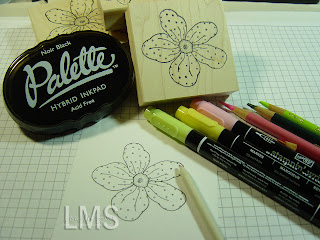
Step 1: Stamp an outline image. I've used Palette Hybrid in Noir with an Outlines Rubber Stamp. Isn't this an amazing flower outline? I really love it. I have all three sizes of the flower.


Step 2: Using markers, color the image carefully with a light ink. I used Pretty in Pink SU marker for the petals and So Saffron for the center.


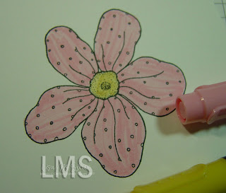
Step 3: Highlight the colored image with matching Prismacolor pencils (I had to practice a bit to see what would match first). I used Rose to color over the image. I colored in darker on the folds to add dimension.


Step 4: Layer a second (maybe third) color of pencils to deepen the highlights. I used a red pencil in this case.


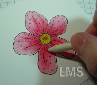
Step 5: With a blending stump, meld the colors for a smooth and seamless result. I keep a piece of sandpaper handy to "clean" the stump between colors or when it gets excessively dirty.


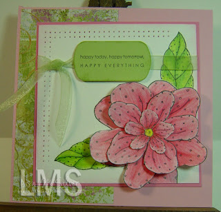
Step 6: Finish the card. I colored multiples of the flowers in different sizes to layer for added effect.

I'll have another quick tutorial tomorrow or Sunday to show another way to highlight an image.

Thanks!

Lisa
Edited to add: The colors in the final card just weren't done justice from my camera.